
Components
Components are modules with specific chunks of UI with more visual styling than any other layer. The components in Layr are highly experimental.
Card UI
Card displays content that carries a visual metaphor of a playing card. For information on this pattern, checkout Using Card-Based Design To Enhance UX from Nick Babich.

CNN
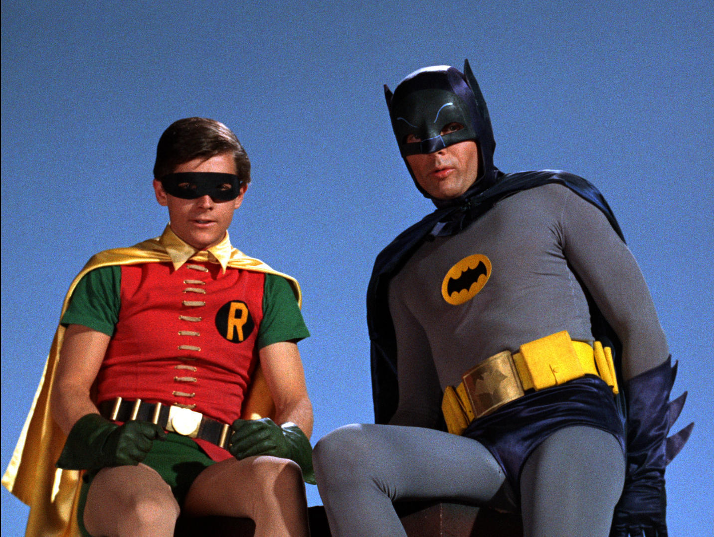
Adam West is back as Batman
Lisa Respers France —Here's a perfect one for a Throwback Thursday: Adam West, Burt Ward and Julie Newmar are reprising their famous "Batman" roles in the new animated film "Batman: Return of the Caped Crusaders.
View sourceHTML + CSS
HTML
<article class="c-Card u-ov--hid u-mxa">
<figure class="c-Card__figure o-intrinsic o-intrinsic--16x9">
<img src="http://mediad.publicbroadcasting.net/p/shared/npr/styles/x_large/nprshared/201411/363561279.jpg" class="o-intrinsic__item u-fit--cover u-bl" alt="Adam West is back as Batman"/>
</figure>
<header class="u-pt3 u-px3 u-mb2 o-Flex o-Flex--center--h">
<img class="o-Icon o-Icon--xs u-mr2" src="http://i.cdn.turner.com/cnn/.e1mo/img/4.0/logos/logo_cnn_badge_2up.png" alt="CSS-Tricks Logo"/>
<h1 class="small u-system u-ltgray u-mb0">CNN</h1>
</header>
<div class="c-Card__content u-px3 u-pb3">
<h2 class="h6">
<a href="#">Adam West is back as Batman</a>
</h2>
<small class="u-caps u-ltgray">Lisa Respers France — <time>August 18, 2016</time>
</small>
<p class="u-bl u-wd--100" style="white-space:normal;">Here's a perfect one for a Throwback Thursday: Adam West, Burt Ward and Julie Newmar are reprising their famous "Batman" roles in the new animated film "Batman: Return of the Caped Crusaders.</p>
</div>
</article>CSS
/*---------Card UI----------*/

:root {
  --card-max: 25rem;
  --card-bg: white;
  --card-radius: var(--radius-2);
  --card-shadow: var(--shadow-2);
  --card-timing: calc(var(--base-dur) / 2);
}

.c-Card {
  display: block;
  position: relative;
  width: 100%;
  max-width: var(--card-max);
  background: var(--card-bg);
  border-radius: var(--card-radius);
  box-shadow: var(--card-shadow);
  transform: scale(1, 1);
  transition: transform var(--card-timing) ease-in-out;
  z-index: 1;
}

.c-Card::before {
  content: '';
  position: absolute;
  top: 0;
  right: 0;
  left: 0;
  bottom: 0;
  z-index: -1;
  border-radius: var(--card-radius);
  transition: opacity var(--card-timing) ease-in-out;
  box-shadow: var(--card-shadow);
  opacity: .5;
  height: 100%;
  width: 100%;
}

.c-Card--hover:hover {
  transform: scale(1.1, 1.1);
}

.c-Card--hover:hover::before {
  opacity: 1;
}

.c-Card__figure {
  width: 100%;
  z-index: inherit;
}

.c-Card__content {
  font-size: 87.5%;
  z-index: inherit;
}
Field
Visual skins for <input> and <textarea> elements.
View sourceHTML + CSS
HTML
<section class="o-Flex o-Flex--wrap">
  <div class="o-col--12/12 o-col--6/12@md u-p2">
    <label for="ti" class="u-gray u-mb1 u-bl">Text Field</label>
    <input type="text" class="c-Field" id="ti" name="ti" value placeholder="Text"/>
  </div>
  <div class="o-col--12/12 o-col--6/12@md u-p2">
    <label for="num" class="u-gray u-mb1 u-bl">Number Field</label>
    <input type="number" class="c-Field" id="num" name="num" value placeholder="0-9"/>
  </div>
  <div class="o-col--12/12 o-col--6/12@md u-p2">
    <label for="tid" class="u-gray u-mb1 u-bl">Disabled Field</label>
    <input type="text" class="c-Field" id="tid" name="tid" value disabled placeholder="Disabled"/>
  </div>
  <div class="o-col--12/12 u-p2">
    <label for="txt" class="u-gray u-mb1 u-bl">Textarea Field</label>
    <textarea id="txt" name="txt" rows="8" cols="40" class="c-Field c-Field--text">
    </textarea>
  </div>
</section>
CSS
/*---------Field Input Component----------*/

:root {
  --field-min: 5rem;
}

.c-Field {
  padding: var(--form-inner-sp);
  box-shadow: var(--form-shadow);
  border: var(--form-border) var(--form-border-color);
  max-width: var(--form-mxw);
  width: var(--form-width);
  height: var(--form-height);
  border-radius: var(--form-radius);
}

.c-Field[disabled],
.c-Field:disabled {
  opacity: .5;
  background: color-mix(in srgb, var(--form-color) 10%, transparent);
  border-color: color-mix(in srgb, var(--form-offsetColor) 50%, transparent);
}

.c-Field::placeholder {
  font-style: italic;
}

.c-Field::-webkit-calendar-picker-indicator {
  opacity: 1 !important;
}

.c-Field--text {
  resize: none;
  min-height: var(--field-min);
}

.c-Field:focus {
  background: var(--offwhite);
  color: var(--form-color);
  border-color: var(--form-color);
  outline: 4px auto var(--form-color);
}
Select Custom Input
This is a pattern to change the skin of <select> element without losing its inherent accessibility.
View sourceHTML + CSS
HTML
<div class="o-Column--12/12 o-Column--6/12@md u-mxa u-p2">
  <label for="slct" class="u-gray u-mb1 u-bl">Select</label>
  <div class="c-Select">
    <select class="c-Select__elm" name="slct" id="slct">
      <option value="value1">Value 1</option>
      <option value="value2">Value 2</option>
      <option value="value3" selected>Value 3</option>
      <option value="value4">Value 4</option>
      <option value="value5">Value 5</option>
    </select>
  </div>
</div>
CSS
/*---------Select Component----------*/

:root {
  --select-border: var(--form-border) var(--form-border-color);
  --select-radius: var(--form-radius);
  --select-w: var(--form-width);
  --select-h: var(--form-height);
  --select-arrow-color: var(--color-1);
  --select-focus: 4px auto color-mix(in srgb, var(--color-1) 87.5%, transparent);
  --select-arrow: url('data:image/svg+xml;charset=utf-8,%3Csvg width="20" height="8" viewBox="716 323 20 8" xmlns="http://www.w3.org/2000/svg" fill="%23147AAB"%3E%3Cpath d="M726 328.64l7.87-5.51a.717.717 0 0 1 1 .177.725.725 0 0 1-.177 1l-8.233 5.765a.717.717 0 0 1-.46.13.717.717 0 0 1-.46-.13l-8.233-5.765a.725.725 0 0 1-.177-1 .717.717 0 0 1 1-.176l7.87 5.51z"/%3E%3C/svg%3E');
}

.c-Select {
  max-width: var(--form-mxw);
  width: var(--select-w);
  height: var(--select-h);
  border: var(--select-border);
  border-radius: var(--select-radius);
  position: relative;
  z-index: 2;
  overflow: hidden;
}

.c-Select::after {
  content: '';
  display: block;
  background-repeat: no-repeat;
  background-image: var(--select-arrow);
  background-position: center center;
  background-size: 35%;
  border-left: var(--select-border);
  position: absolute;
  z-index: 1;
  right: 0;
  margin: 0;
  width: 18.75%;
  max-width: 3rem;
  height: 100%;
}

.c-Select__elm {
  appearance: none;
  display: block;
  width: 100%;
  height: 100%;
  margin: 0;
  padding: var(--form-inner-sp);
  background: none;
  border: 0;
  position: absolute;
  top: 0;
  left: 0;
  right: 0;
  bottom: 0;
  z-index: 3;
}

.c-Select__elm::-moz-focus-inner,
.c-Select__elm:focus {
  outline: var(--select-focus);
}
Range Input
This is a skin for the <input type='range'> element. You can modify the color of the range’s track by overriding --range-color. Currently, styles don’t work in IE, Mozilla or Opera, but should fallback nicely.
View sourceHTML + CSS
HTML
<div class="o-Column--6/12 u-p2 u-center u-mxa">
  <label for="rng" class="u-mb1 u-bl">Range</label>
  <input type="range" id="rng" name="rng" class="c-Range" value="5" min="1" max="10"/>
</div>
CSS
/*---------Range Component----------*/

/*
  TODO: Mozilla and MS Prefixes or equivalent for thumb and track pseudo selectors
*/

:root {
  --range-thumb-w: calc(var(--form-height) / 2);
  --range-thumb-h: calc(var(--form-height) / 2);
  --range-thumb-bg: linear-gradient(color-mix(in srgb, var(--form-offsetColor) 87.5%, white), color-mix(in srgb, var(--form-offsetColor) 97.5%, white));
  --range-thumb-radius: 50%;
  --range-color: var(--color-1);
  --range-track-h: calc(var(--range-thumb-h) / 3);
  --range-shadow: var(--shadow-1);
  --range-timing: calc(var(--base-dur) / 2);
}

.c-Range {
  max-width: var(--form-mxw);
  width: var(--form-width);
  height: var(--form-height);
  appearance: none;
}

.c-Range:focus { outline: none; }


.c-Range::-webkit-slider-runnable-track {
  color: var(--range-color);
  background: color-mix(in srgb, var(--range-color) 87.5%, transparent);
  height: var(--range-track-h);
  border-radius: 3px;
  cursor: pointer;
  appearance: none;
}

.c-Range:focus::-webkit-slider-runnable-track {
  background: var(--range-color);
}

.c-Range::-webkit-slider-thumb {
  border: 0;
  height: var(--range-thumb-h);
  width: var(--range-thumb-w);
  border-radius: var(--range-thumb-radius);
  background: var(--range-thumb-bg);
  box-shadow: var(--range-shadow);
  appearance: none;
  cursor: pointer;
  margin-top: calc(var(--range-thumb-h) / -3);
  transition: all var(--range-timing) linear;
}

.c-Range::-webkit-slider-container,
.c-Range::-webkit-media-slider-container {
  align-items: center;
}
Buttons
Simple skin for buttons to be applied on <input type='button'>, <button>, and <a> elements.
View sourceHTML + CSS
HTML
<div class="u-mb4">
  <h6 class="u-mb2 small u-caps">Xtra Small Buttons</h6>
  <a class="c-Btn c-Btn--xs u-m1">Button</a>
</div>
<div class="u-mb4">
  <h6 class="u-mb2 small u-caps">Buttons</h6>
  <a class="c-Btn u-m1">Button</a>
</div>
<div class="u-mb4">
  <h6 class="u-mb2 small u-caps">Medium Buttons</h6>
  <a class="c-Btn c-Btn--md u-m1">Button</a>
</div>
<div class="u-mb4">
  <h6 class="u-mb2 small u-caps">Large Buttons</h6>
  <a class="c-Btn c-Btn--lg u-m1">Button</a>
</div>
<div>
  <h6 class="u-mb2 small u-caps">Applied to Input Nodes</h6>
  <button class="c-Btn c-Btn--md c-Btn--3 u-m1">Button</button>
  <input type="button" value="Button" class="c-Btn c-Btn--xs u-m1"/>
  <input type="submit" value="Button" class="c-Btn c-Btn--o c-Btn--o--2 u-m1"/>
</div>
CSS
/*---------Buttons UI----------*/

:root {
  --btn-radius: .25rem;
  --btn-color: var(--blue);
  --btn-color-hover: var(--blue-dark);
  --btn-border: 2px solid;
}

.c-Btn {
  background: var(--btn-color);
  color: white;
  border: var(--btn-border);
  border-color: transparent;
  padding: var(--form-inner-sp);
  max-width: var(--form-mxw);
  border-radius: var(--btn-radius);
  transition: color var(--base-dur) linear, background var(--base-dur) linear, border var(--base-dur) linear;
  cursor: pointer;
  display: inline-block;
  font-weight: 500;
}

.c-Btn--xs {
  font-size: 87.5%;
  padding: calc(var(--base-spacing) / 4) calc(var(--base-spacing) * .75);
}

.c-Btn--md {
  font-size: 112.5%;
  padding: calc(var(--base-spacing) / 2) calc(var(--base-spacing) * 2);
}


.c-Btn--lg {
  font-size: 125%;
  padding: calc(var(--base-spacing) * .75) calc(var(--base-spacing) * 2.5);
}

.c-Btn:hover {
  background-color: var(--btn-color-hover);
  color: white;
}
Input Group
This is a visual pattern for any time you want <input type="text"> inlined with a button. Admittedly this component is a little rough around the edges.
Sign Up for Our Newsletter
View sourceHTML + CSS
HTML
<div class="o-Container--xs u-p3 u-sh--2 u-bg--offwhite u-mxa">
  <h6 class="small u-mb3">Sign Up for Our Newsletter</h6>
  <div class="c-InputGroup o-Flex">
    <input type="text" class="c-InputGroup--first c-Field u-m0" placeholder="address@email.com"/>
    <button class="c-Btn c-InputGroup--last">Submit</button>
  </div>
</div>
CSS
/*---------Input Group----------*/

:root {
  --input-radius: var(--form-radius);
}

.c-InputGroup {
  position: relative;
  border-radius: var(--input-radius);
  overflow: hidden;
}

.c-InputGroup--first {
  border-radius: 0;
  border-right: 0;
}

.c-InputGroup--last { border-radius: 0; }
Radio Group
Radio group pattern can be used as links or as <input type="radio"> elements. Check out the HTML markup to see it in action.
View sourceHTML + CSS
HTML
<h6 class="u-mb2 small u-caps">Radio Inputs</h6>
<div class="c-RadioGroup small o-Flex o-Flex--j--sb u-w500 u-mxa u-py4 u-center">
  <input type="radio" name="r" id="ru" class="c-RadioGroup__elm"/>
  <label for="ru" class="c-RadioGroup__opt o-Flex--center--v u-p2">Recently Updated</label>
  <input type="radio" name="r" id="created" class="c-RadioGroup__elm" checked/>
  <label for="created" class="c-RadioGroup__opt o-Flex--center--v u-p2">Created On</label>
  <input type="radio" name="r" id="az" class="c-RadioGroup__elm"/>
  <label for="az" class="c-RadioGroup__opt o-Flex--center--v u-p2">A to Z</label>
</div>
<h6 class="u-mb2 small u-caps">Links</h6>
<div class="c-RadioGroup small o-Flex o-Flex--space u-w500 u-mxa u-py4 u-center">
  <a href="#" class="c-RadioGroup__opt o-Flex--center--v u-p2">Recently Updated</a>
  <a href="#" class="c-RadioGroup__opt o-Flex--center--v u-p2 active">Created On</a>
  <a href="#" class="c-RadioGroup__opt o-Flex--center--v u-p2">A to Z</a>
</div>
CSS
/*----------Radio Group----------*/

:root {
  --rdg-corner: .425rem;
  --rdg-width: 27.5rem;
  --rdg-color: var(--color-1);
  --rdg-offset-color: var(--color-5);
  --rdg-timing: calc(var(--base-dur) / 2);
}

.c-RadioGroup {
  max-width: var(--rdg-width);
  width: 100%;
}

.c-RadioGroup__opt {
  width: calc(100% / 3);
  border: 1px solid var(--rdg-offset-color);
  color: var(--rdg-offset-color);
  flex: 1;
  cursor: pointer;
  transition: background var(--rdg-timing) ease-in-out, color var(--rdg-timing) ease-in-out;
}

.c-RadioGroup__opt:not(:last-of-type) { border-right: 0; }

.c-RadioGroup__opt:first-of-type {
  border-radius: var(--rdg-corner) 0 0 var(--rdg-corner);
}

.c-RadioGroup__opt:last-of-type {
  border-radius: 0 var(--rdg-corner) var(--rdg-corner) 0;
}

.c-RadioGroup__elm { display: none; }

.c-RadioGroup__elm:checked + .c-RadioGroup__opt,
.c-RadioGroup__opt.active {
  background: var(--rdg-color);
  color: white;
}
Progress
This is a skin for the <progress> element. You can modify the color by overriding --progress-color.
View sourceHTML + CSS
HTML
<div class="u-pt5 u-py3">
  <progress max="100" value="80" class="c-Progress">
  </progress>
</div>
CSS
/*---------Range Component----------*/

/*
  TODO: Mozilla and MS Prefixes or equivalent for thumb and track pseudo selectors
*/

:root {
  --range-thumb-w: calc(var(--form-height) / 2);
  --range-thumb-h: calc(var(--form-height) / 2);
  --range-thumb-bg: linear-gradient(color-mix(in srgb, var(--form-offsetColor) 87.5%, white), color-mix(in srgb, var(--form-offsetColor) 97.5%, white));
  --range-thumb-radius: 50%;
  --range-color: var(--color-1);
  --range-track-h: calc(var(--range-thumb-h) / 3);
  --range-shadow: var(--shadow-1);
  --range-timing: calc(var(--base-dur) / 2);
}

.c-Range {
  max-width: var(--form-mxw);
  width: var(--form-width);
  height: var(--form-height);
  appearance: none;
}

.c-Range:focus { outline: none; }


.c-Range::-webkit-slider-runnable-track {
  color: var(--range-color);
  background: color-mix(in srgb, var(--range-color) 87.5%, transparent);
  height: var(--range-track-h);
  border-radius: 3px;
  cursor: pointer;
  appearance: none;
}

.c-Range:focus::-webkit-slider-runnable-track {
  background: var(--range-color);
}

.c-Range::-webkit-slider-thumb {
  border: 0;
  height: var(--range-thumb-h);
  width: var(--range-thumb-w);
  border-radius: var(--range-thumb-radius);
  background: var(--range-thumb-bg);
  box-shadow: var(--range-shadow);
  appearance: none;
  cursor: pointer;
  margin-top: calc(var(--range-thumb-h) / -3);
  transition: all var(--range-timing) linear;
}

.c-Range::-webkit-slider-container,
.c-Range::-webkit-media-slider-container {
  align-items: center;
}
Tabbed UI
This tabbed UI is powered by Tabby to move the .active class around on them.
Buffalo Springfield
Once they reached Los Angeles, Young and Palmer met up with Stephen Stills, Richie Furay, and Dewey Martin to form Buffalo Springfield. A mixture of folk, country, psychedelia, and rock, lent a hard edge by the twin lead guitars of Stills and Young, made Buffalo Springfield a critical success, and their first record Buffalo Springfield (1966) sold well after Stills' topical song "For What It's Worth" became a hit, aided by Young's melodic harmonics played on electric guitar. According to Rolling Stone, the Rock and Roll Hall of Fame and other sources, Buffalo Springfield helped create the genres of folk rock and country rock.
Distrust of their management, as well as the arrest and deportation of Palmer, exacerbated the already strained relations among the group members and led to Buffalo Springfield's demise. A second album, Buffalo Springfield Again, was released in late 1967, but two of Young's three contributions were solo tracks recorded apart from the rest of the group.
In many ways, these three songs on Buffalo Springfield Again, "Mr. Soul", "Expecting to Fly", and "Broken Arrow", are harbingers of much of Young's later work in that, although they all share deeply personal, almost idiosyncratic lyrics, they also present three very different musical approaches to the arrangement of what is essentially an original folk song. "Mr. Soul" is the only Young song of the three that all five members of the group performed together. In contrast, "Broken Arrow" was confessional folk-rock of a kind that would characterize much of the music that emerged from the singer-songwriter movement. Young's experimental production intersperses each verse with snippets of sound from other sources, including opening the song with a soundbite of Dewey Martin singing "Mr. Soul" and closing it with the thumping of a heartbeat. "Expecting to Fly" was a lushly produced ballad similar to the baroque pop of the mid-1960s, featuring a string arrangement that Young's co-producer for the track, Jack Nitzsche, would dub "symphonic pop".
In May 1968, the band split up for good, but to fulfill a contractual obligation, a final album, Last Time Around, was released, primarily from recordings made earlier that year. Young contributed the songs "On the Way Home" and "I Am a Child", singing lead on the latter. In 1997, the band was inducted into the Rock & Roll Hall of Fame; Young did not appear at the ceremony. The three surviving members, Furay, Stills and Young, appeared together as Buffalo Springfield at Young's annual Bridge School Benefit on October 23–24, 2010, and at Bonnaroo in the summer of 2011.
Going solo, Crazy Horse
After the break-up of Buffalo Springfield, Young signed a solo deal with Reprise Records, home of his colleague and friend Joni Mitchell, with whom he shared a manager, Elliot Roberts, who manages Young to this day. Young and Roberts immediately began work on Young's first solo record, Neil Young (January 22, 1969), which received mixed reviews. In a 1970 interview, Young deprecated the album as being "overdubbed rather than played", and the quest for music that expresses the spontaneity of the moment has long been a feature of his career. Nevertheless, the album contains some songs that remain a staple of his live shows, most notably "The Loner".
For his next album, Young recruited three musicians from a band called The Rockets: Danny Whitten on guitar, Billy Talbot on bass guitar, and Ralph Molina on drums. These three took the name Crazy Horse (after the historical figure of the same name), and Everybody Knows This Is Nowhere (May 1969), is credited to "Neil Young with Crazy Horse". Recorded in just two weeks, the album opens with one of Young's most familiar songs, "Cinnamon Girl", and is dominated by two more, "Cowgirl in the Sand" and "Down by the River", that feature improvisations with Young's distinctive electric guitar solos billowing out over the hypnotic Crazy Horse backing. Young reportedly wrote all three songs on the same day, while nursing a high fever of 103 °F (39 °C) in bed.
Crosby, Stills, Nash, and Young
Shortly after the release of Everybody Knows This Is Nowhere, Young reunited with Stephen Stills by joining Crosby, Stills & Nash, who had already released one album Crosby, Stills & Nash as a trio in May 1969. Young was originally offered a position as a sideman, but agreed to join only if he received full membership, and the group – winners of the 1969 "Best New Artist" Grammy Award – was renamed Crosby, Stills, Nash & Young. The quartet debuted in Chicago on August 16, 1969, and later performed at the famous Woodstock Festival, during which Young skipped the majority of the acoustic set and refused to be filmed during the electric set, even telling the cameramen: "One of you fuckin' guys comes near me and I'm gonna fuckin' hit you with my guitar". During the making of their first album, Déjà Vu (March 11, 1970), the musicians frequently argued, particularly Young and Stills, who both fought for control. Stills continued throughout their lifelong relationship to criticize Young, saying that he "wanted to play folk music in a rock band." Despite the tension, Young's tenure with CSN&Y coincided with the band's most creative and successful period, and greatly contributed to his subsequent success as a solo artist.
Young wrote "Ohio" following the Kent State massacre on May 4, 1970. The song was quickly recorded by CSN&Y and immediately released as a single, even though CSN&Y's "Teach Your Children" was still climbing the singles charts.
View sourceHTML + CSS
HTML
<section class="c-Tabs">
<nav class="c-Tabs__nav o-Flex u-w700" data-tabs="true">
<a href="#tabA" data-tab="true" class="c-Tabs__marker u-py2 u-px3 active">Buffalo Springfield</a>
<a href="#tabB" data-tab="true" class="c-Tabs__marker u-py2 u-px3">Early Solo Work</a>
<a href="#tabC" data-tab="true" class="c-Tabs__marker u-py2 u-px3">CSNY</a>
</nav>
<div class="c-Tabs__content u-p4" data-tabs-content="true">
<div data-tabs-pane="true" class="c-Tabs__pane active" id="tabA" data-tab-id="tabA">
<h6>Buffalo Springfield</h6>
<p>Once they reached Los Angeles, Young and Palmer met up with Stephen Stills, Richie Furay, and Dewey Martin to form Buffalo Springfield. A mixture of folk, country, psychedelia, and rock, lent a hard edge by the twin lead guitars of Stills and Young, made Buffalo Springfield a critical success, and their first record Buffalo Springfield (1966) sold well after Stills' topical song "For What It's Worth" became a hit, aided by Young's melodic harmonics played on electric guitar. According to Rolling Stone, the Rock and Roll Hall of Fame and other sources, Buffalo Springfield helped create the genres of folk rock and country rock.</p>
<p>Distrust of their management, as well as the arrest and deportation of Palmer, exacerbated the already strained relations among the group members and led to Buffalo Springfield's demise. A second album, Buffalo Springfield Again, was released in late 1967, but two of Young's three contributions were solo tracks recorded apart from the rest of the group.</p>
<p>In many ways, these three songs on Buffalo Springfield Again, "Mr. Soul", "Expecting to Fly", and "Broken Arrow", are harbingers of much of Young's later work in that, although they all share deeply personal, almost idiosyncratic lyrics, they also present three very different musical approaches to the arrangement of what is essentially an original folk song. "Mr. Soul" is the only Young song of the three that all five members of the group performed together. In contrast, "Broken Arrow" was confessional folk-rock of a kind that would characterize much of the music that emerged from the singer-songwriter movement. Young's experimental production intersperses each verse with snippets of sound from other sources, including opening the song with a soundbite of Dewey Martin singing "Mr. Soul" and closing it with the thumping of a heartbeat. "Expecting to Fly" was a lushly produced ballad similar to the baroque pop of the mid-1960s, featuring a string arrangement that Young's co-producer for the track, Jack Nitzsche, would dub "symphonic pop".</p>
<p>In May 1968, the band split up for good, but to fulfill a contractual obligation, a final album, Last Time Around, was released, primarily from recordings made earlier that year. Young contributed the songs "On the Way Home" and "I Am a Child", singing lead on the latter. In 1997, the band was inducted into the Rock & Roll Hall of Fame; Young did not appear at the ceremony. The three surviving members, Furay, Stills and Young, appeared together as Buffalo Springfield at Young's annual Bridge School Benefit on October 23–24, 2010, and at Bonnaroo in the summer of 2011.</p>
</div>
<div data-tabs-pane="true" class="c-Tabs__pane" id="tabB" data-tab-id="tabB">
<h6>Going solo, Crazy Horse</h6>
<p>After the break-up of Buffalo Springfield, Young signed a solo deal with Reprise Records, home of his colleague and friend Joni Mitchell, with whom he shared a manager, Elliot Roberts, who manages Young to this day. Young and Roberts immediately began work on Young's first solo record, Neil Young (January 22, 1969), which received mixed reviews. In a 1970 interview, Young deprecated the album as being "overdubbed rather than played", and the quest for music that expresses the spontaneity of the moment has long been a feature of his career. Nevertheless, the album contains some songs that remain a staple of his live shows, most notably "The Loner".</p>
<p>For his next album, Young recruited three musicians from a band called The Rockets: Danny Whitten on guitar, Billy Talbot on bass guitar, and Ralph Molina on drums. These three took the name Crazy Horse (after the historical figure of the same name), and Everybody Knows This Is Nowhere (May 1969), is credited to "Neil Young with Crazy Horse". Recorded in just two weeks, the album opens with one of Young's most familiar songs, "Cinnamon Girl", and is dominated by two more, "Cowgirl in the Sand" and "Down by the River", that feature improvisations with Young's distinctive electric guitar solos billowing out over the hypnotic Crazy Horse backing. Young reportedly wrote all three songs on the same day, while nursing a high fever of 103 °F (39 °C) in bed.</p>
</div>
<div data-tabs-pane="true" class="c-Tabs__pane" id="tabC" data-tab-id="tabC">
<h6>Crosby, Stills, Nash, and Young</h6>
<p>Shortly after the release of Everybody Knows This Is Nowhere, Young reunited with Stephen Stills by joining Crosby, Stills & Nash, who had already released one album Crosby, Stills & Nash as a trio in May 1969. Young was originally offered a position as a sideman, but agreed to join only if he received full membership, and the group – winners of the 1969 "Best New Artist" Grammy Award – was renamed Crosby, Stills, Nash & Young. The quartet debuted in Chicago on August 16, 1969, and later performed at the famous Woodstock Festival, during which Young skipped the majority of the acoustic set and refused to be filmed during the electric set, even telling the cameramen: "One of you fuckin' guys comes near me and I'm gonna fuckin' hit you with my guitar". During the making of their first album, Déjà Vu (March 11, 1970), the musicians frequently argued, particularly Young and Stills, who both fought for control. Stills continued throughout their lifelong relationship to criticize Young, saying that he "wanted to play folk music in a rock band." Despite the tension, Young's tenure with CSN&Y coincided with the band's most creative and successful period, and greatly contributed to his subsequent success as a solo artist.</p>
<p>Young wrote "Ohio" following the Kent State massacre on May 4, 1970. The song was quickly recorded by CSN&Y and immediately released as a single, even though CSN&Y's "Teach Your Children" was still climbing the singles charts.</p>
</div>
</div>
</section>CSS
/*---------Tabs Component----------*/

:root {
  --tabs-active-color: white;
  --tabs-radii: 0.375rem;
  --tabs-spacer: 0.5rem;
  --tabs-border: 1px solid var(--color-5);
  --tabs-background: var(--color-5);
  --tabs-marker-color: var(--color-1);
  --tabs-marker-inactive-color: var(--color-5);
}

.c-Tabs {
  z-index: 5;
}

.c-Tabs__nav {
  margin-bottom: -1px;
  white-space: nowrap;
  overflow-x: auto;
  -webkit-overflow-scrolling: touch;
  -ms-overflow-style: -ms-autohiding-scrollbar;
}

.c-Tabs__marker {
  flex: 1 1 auto;
  min-width: 6rem;
  border-right: var(--tabs-border);
  border-left: var(--tabs-border);
  border-top: var(--tabs-border);
  border-radius: var(--tabs-radii) var(--tabs-radii) 0 0;
  background: color-mix(in srgb, var(--tabs-background) 25%, transparent);
  color: var(--tabs-marker-inactive-color);
}

.c-Tabs__marker:hover {
  color: color-mix(in srgb, var(--litegray) 85%, black);
  background: color-mix(in srgb, var(--tabs-background) 75%, transparent);
}

.c-Tabs__marker.active {
  background: var(--tabs-active-color);
  color: var(--tabs-marker-color);
}

.c-Tabs__content {
  z-index: 4;
  border: var(--tabs-border);
  background: var(--tabs-active-color);
}

.c-Tabs__pane {
  opacity: 0;
  visibility: hidden;
  height: 0;
  width: 0;
  position: absolute;
  top: 0;
  left: 0;
}

.c-Tabs__pane.active {
  opacity: 1;
  visibility: visible;
  width: 100%;
  height: auto;
  position: static;
}

@media only screen and (min-width: 48rem) {
  .c-Tabs__marker:not(:last-of-type) {
    margin-right: var(--tabs-spacer);
  }
}
Dropdown UI
This is a simple dropdown, meant to be trading by an .active for a .hidden class on the component. Position is yours to manage. Modifier --l moves the arrow to the left, --r to the right and --c centers the arrow.
View sourceHTML + CSS
HTML
<a href="#" class="c-Btn">Button</a>
<div class="c-Dropdown__container u-relative u-py6 u-mb6">
  <div class="u-absolute" style="left:0px;top:0px;">
    <div class="c-Dropdown c-Dropdown--l u-mxw--fit active" style="width:18rem;">
      <h3 class="h6 u-p2">
        <a href="#">Heading</a>
      </h3>
      <hr class="u-bg--ltgray"/>
      <nav class="c-Nav small">
        <ul class="o-UIList">
          <li class="o-UIList__item u-p2">
            <a href="#" class="u-gray200">Preferences</a>
          </li>
          <li class="o-UIList__item u-p2">
            <a href="#" class="u-gray200">Help</a>
          </li>
          <li class="o-UIList__item u-p2">
            <a href="#" class="u-gray200">Sign Out</a>
          </li>
        </ul>
      </nav>
    </div>
  </div>
</div>
CSS
/*---------Dropdown Component----------*/

:root {
  --curve: cubic-bezier(.16, .58, .8, .43);
  --dropdown-header: var(--offwhite);
  --dropdown-background: var(--offwhite);
  --dropdown-arrow-size: .625rem;
  --dropdown-width: 25rem;
}

.c-Dropdown {
  background: var(--dropdown-background);
  box-shadow: var(--shadow-1);
  border-top: 2px solid var(--dropdown-header);
  position: relative;
  opacity: 1;
  visibility: visible;
  transition: opacity 250ms var(--curve), visibility 250ms var(--curve);
  z-index: 999;
  max-width: var(--dropdown-width);
}

.c-Dropdown::before {
  content: '';
  position: absolute;
  top: calc(var(--dropdown-arrow-size) * -1);
  width: 0;
  height: 0;
  bottom: 0;
  border-left: .75rem solid transparent;
  border-right: .75rem solid transparent;
  border-bottom: var(--dropdown-arrow-size) solid var(--dropdown-header);
}

.c-Dropdown--l::before {
  content: '';
  left: calc(var(--dropdown-arrow-size) / 2);
}

.c-Dropdown--r::before {
  content: '';
  right: calc(var(--dropdown-arrow-size) / 2);
}

.c-Dropdown--c::before {
  content: '';
  left: 0;
  right: 0;
  margin: 0 auto;
}

.c-Dropdown.hidden {
  opacity: 0;
  visibility: hidden;
  pointer-events: none;
}

.c-Dropdown.active {
  visibility: visible;
  opacity: 1;
}
Run the reference implementation
npm install
npm run dev --workspace layr-documentation